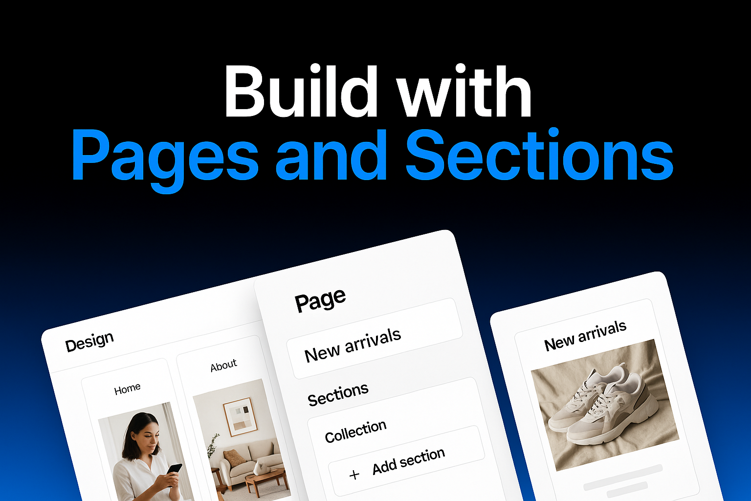
Pages and Sections
Pages are the main containers for your app's content. Each page represents a distinct area of your application with its own unique purpose and layout. Pages help organize your content in a logical and intuitive way, making it easier for users to navigate through your app. You can create multiple pages for different product categories, information sections, or features of your business.
Sections are the building blocks of your Taptool mobile app's content. They allow you to create a rich, engaging experience for your customers by displaying your products, collections, and brand content in visually appealing ways.
Available Section Types
Taptool offers a variety of section types that you can add to your app:
1. Hero Banner
A large banner image that appears at the top of your app screen. Ideal for:
- Highlighting promotions
- Featuring new product launches
- Displaying seasonal campaigns
2. Product Carousel
A horizontally scrollable row of products. Perfect for:
- Showcasing bestsellers
- Featuring new arrivals
- Displaying related products
3. Collection Grid
A grid of your product collections that users can tap to explore. Great for:
- Organizing products by category
- Making navigation intuitive
- Providing visual cues for different product types
4. Text Block
A customizable block of text. Useful for:
- Sharing your brand story
- Explaining product features
- Providing helpful information to customers
5. Image Block
A customizable image or set of images. Ideal for:
- Showcasing lifestyle photography
- Displaying user-generated content
- Creating visual separation between sections
6. Video Block
Embed videos directly in your app. Perfect for:
- Product demonstrations
- Brand storytelling
- Tutorial content
7. Featured Product
A dedicated section highlighting a specific product. Great for:
- Promoting your flagship product
- Highlighting limited edition items
- Showcasing products with special features
Adding New Pages
To add a new page to your app, click the "+" icon next to "app" in the navigation sidebar. When you click on this icon, a new page will appear. You'll need to give your page a name that describes its purpose. Once created, you can add various sections to your new page to build out its content.
Adding New Sections
Step 1: Click the Add Button
To add a new section, locate the small "+" button next to the navigation item where you want to add a new section. This button appears when you hover over navigation items in the sidebar.
Step 2: Choose a Section Type
After clicking the "+" button, a dialog will appear with two options for adding new sections:
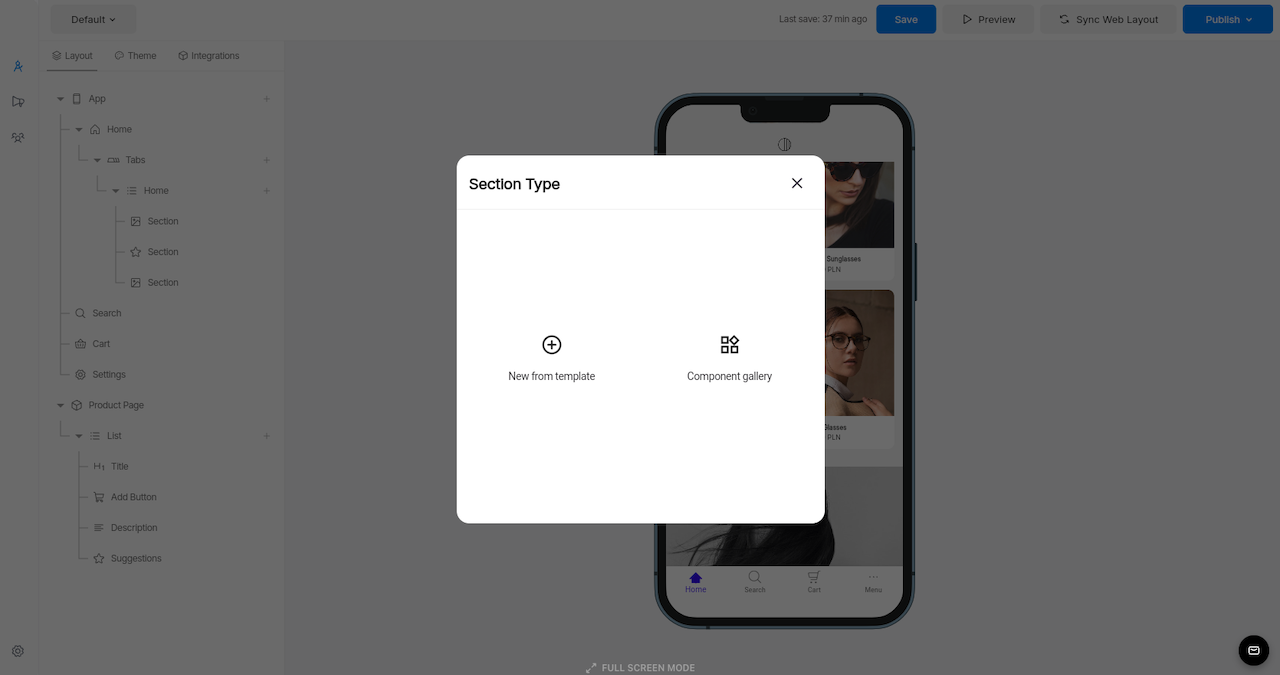
You have two options for adding sections:
Option 1: New from Template
This option allows you to create a new section from a blank template that you can fully customize.
- Click on the "New from template" option
- A new section will be added
- The editing panel will appear on the right side of the screen, where you can customize various aspects of your section
In the editing panel, you can configure:
- Title of the section
- Data source for content
- Background and foreground colors
- Font styles and typography
- Other section-specific settings
Custom Code Template
If you select "Custom Code" from the section type options, you'll be able to create a fully customized section using your own HTML, CSS, and JavaScript code:
When you select this option, the code editor will open with three tabs:
- body.html - For your HTML structure
- styles.css - For your CSS styling
- scripts.js - For JavaScript functionality
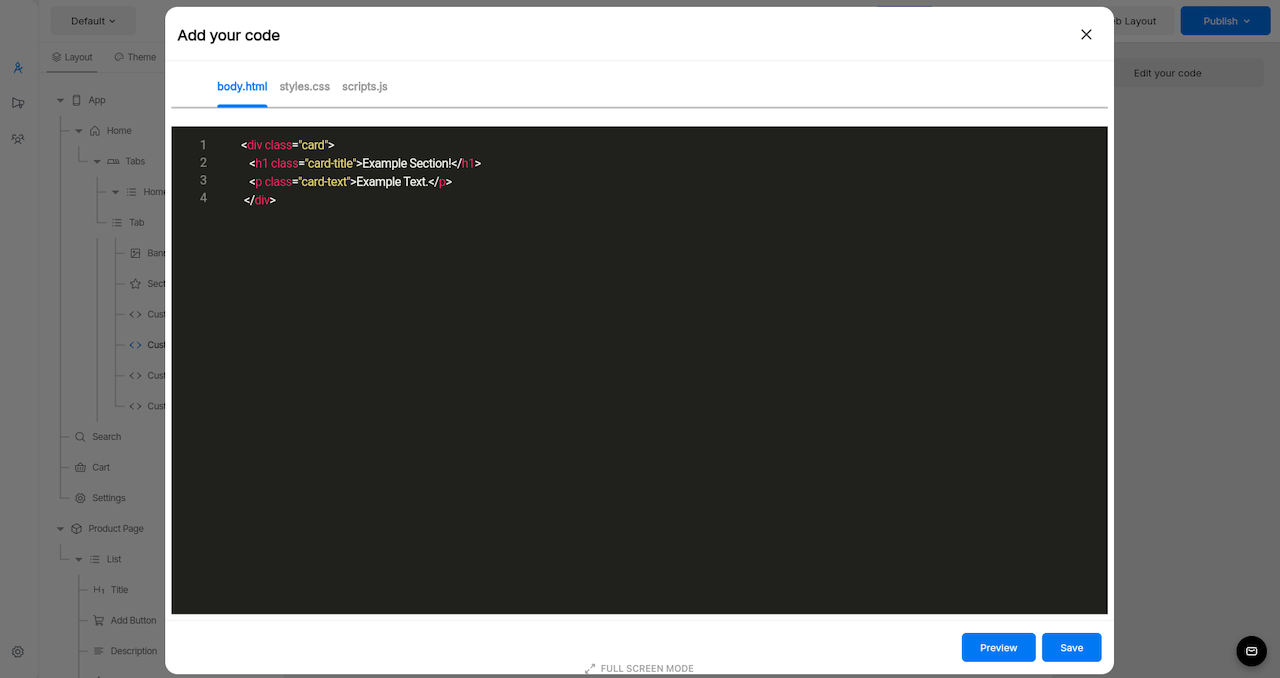
This gives you complete control over the appearance and functionality of your section. You can create entirely custom UI elements, animations, and interactive features that go beyond the standard template options.
After writing your code, use the Preview button to test how it will appear in your app before saving.
Option 2: Component Gallery
The Component Gallery provides pre-designed section templates that you can quickly add to your app.
- Click on the "Component gallery" option
- Browse through the available components in the gallery
- Click on a component to add it to your navigation

The gallery includes various component types such as:
- Featured products displays
- Collection lists
- Hero banners
- And many other specialized sections
Customizing Sections
After clicking on a section, a customization menu appears on the right side of the screen. This menu provides various options to tailor the section according to your needs. Each section type has its own specific customization options.
Reordering Sections
To change the order of your sections just drag and drop on the section you want to move.
Tips for Effective Section Ordering
- Place your most important content near the top for maximum visibility
- Group related sections together to create a logical flow
- Consider the customer journey when arranging sections
- Use high-impact sections (like hero banners) strategically throughout the layout
- Test different arrangements to see what performs best with your customers
Deleting Sections
To remove a section:
Testing Your Navigation
As you make changes to your navigation structure, you can preview how it will look in your app using the preview feature in the Taptool dashboard. This allows you to ensure your navigation is intuitive and visually appealing before publishing. For detailed instructions on testing your app, please refer to our Testing and Preview Guide.
Best Practices for App Navigation
- Keep your navigation structure simple and intuitive
- Use clear, descriptive names for navigation items
- Limit the number of top-level navigation items
- Group related content under tabs
- Ensure your most important sections are easily accessible
- Test your navigation with real users before publishing
By following these steps, you can create a customized app navigation structure that provides an excellent user experience while showcasing your products effectively.
Remember to save your changes by clicking the Save button in the top navigation bar before publishing your app. Saving ensures all your design changes are preserved.

If you attempt to leave the Design section without saving, a popup will appear asking if you want to save your changes, giving you a second chance to preserve your work.
When you're ready to make your changes live, click the Publish button in the upper right corner. For more information on publishing your app, refer to our Publishing Guide.